Brand Editor
How the dashboard editor works — the draft-and-Save model and the three configuration groups
The Brand editor (/{org}/web/brand) is where you configure the widget's look, content, and behaviour. It's a single screen: the settings fill the page, and a live preview of the widget floats in the corner — exactly as it appears on a real site, updating as you edit.
The header holds three controls:
- Light / dark toggle — flips the preview between palettes so you can check both.
- Save changes — commits your edits (enabled only when there are unsaved changes).
…menu — Discard (revert to the last saved state) and Reset to default (restore the default widget configuration).
How editing works
This is the single most important mechanic, and it's the same for every field:
- Every edit goes into one page-wide draft. Changing a colour, uploading a logo, toggling a feature, editing copy — each accumulates into a single pending change set. Nothing is sent to the server yet.
- The live preview updates immediately as you edit. For text, the preview reflects the language you're currently editing.
- Click Save changes (header) to commit the entire draft in one operation — all changes ship together. It's enabled only when there are unsaved changes.
- Discard or reset from the
…menu. Discard throws away all unsaved changes and reverts to the last saved state (and cleans up any media you uploaded but didn't save). Reset to default restores the default widget configuration. - The widget picks up your saved config when it loads. A deployed widget reads its configuration by
publicKey; after Save, new page loads get the update. Unsaved draft changes are visible only in the editor preview, never to real visitors.
The universal flow for any change is: edit → watch the preview → Save. If you don't Save, nothing reaches visitors.
Editing in multiple languages
Many text fields are per-locale. While editing a localised field you choose which language you're editing:
- Editing the default language writes the base value.
- Editing another language writes that locale's override; the base value shows as a placeholder so you know what you're translating.
The preview re-renders in whichever language you're editing. See Localization.
Previewing light vs dark
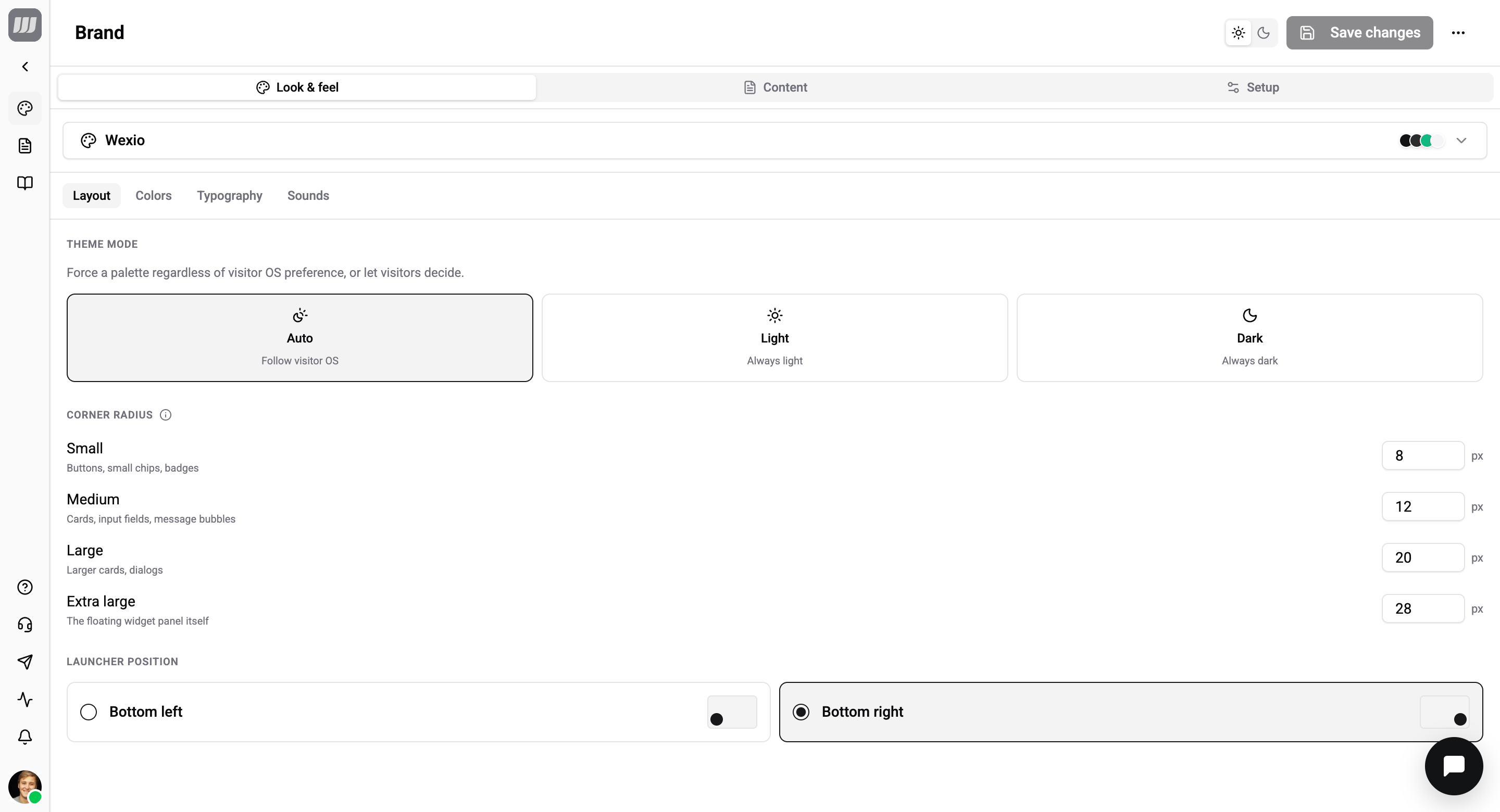
The light / dark toggle in the header is a preview-only switch — it changes what you see in the editor, not the saved setting. To control what visitors actually get, set Theme mode (Auto / Light / Dark) under Look & feel → Layout. With Auto the widget follows each visitor's OS preference; Light or Dark pins it regardless of their system.
The three groups
The settings are split into three top groups (the tabs across the top), each with its own sub-tabs:
| Group | Sub-tabs | Covers | Documented in |
|---|---|---|---|
| Look & feel | Layout · Colors · Typography · Sounds | Theme mode, corner radii, launcher position, the 15-token palette, fonts, notification sounds | Appearance |
| Content | Home · Branding · Messenger · Languages · Visitor profile · Surfaces | Home layout, branding assets, messenger copy, languages, profile & prechat, which surfaces visitors see | Content & surfaces |
| Setup | General · Security · Install | Widget name, default tab, disable toggle, AI auto-reply, bot protection · allowed origins & shared secret · install snippets | Setup + Install |
Theming as a developer
If you'd rather drive theming from code (passing a theme object in the embed config, or overriding --wx-* CSS variables), see Theming & CSS variables.