Content & Surfaces
Home blocks, branding assets, messenger copy, the profile tab, the prechat form, and which tabs visitors see
The Content group controls what's in the widget; the Surfaces sub-tab controls which parts visitors see. All of it follows the draft-and-Save model.
Home
The Home tab is assembled from blocks in a drag-and-drop editor — add, remove, reorder, and edit each block, then Save. Up to 12 blocks. Available block kinds include:
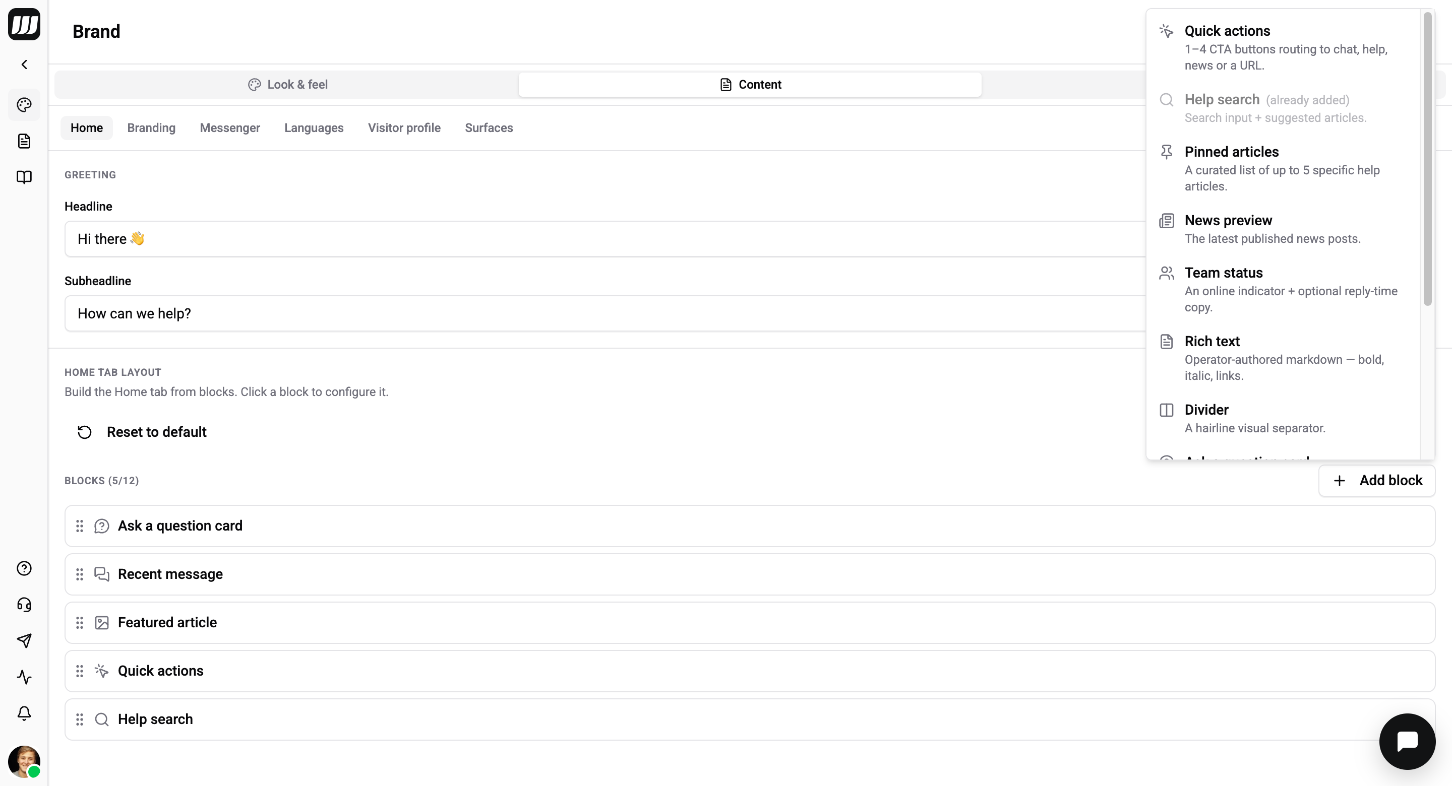
| Block | What it shows |
|---|---|
welcome / greeting | A headline + subheadline at the top. |
quick-actions | 1–4 buttons (open messenger / help / news, or an external URL). |
help-search | A search box with suggested articles (popular / recent / category / manual). |
pinned-articles | Up to 5 hand-picked help articles. |
featured-article | A highlighted news post with a cover image and CTA. |
news-preview | The latest news posts (1–6). |
team-status | Response time and operator avatars. |
ask-question | A prompt that opens the messenger, help, or news. |
recent-message | The visitor's last conversation. |
rich-text | Sanitised markdown (no headings, images, or scripts). |
divider | A visual separator. |
Block copy is translatable per locale. The full block schema is in the config reference.
Branding
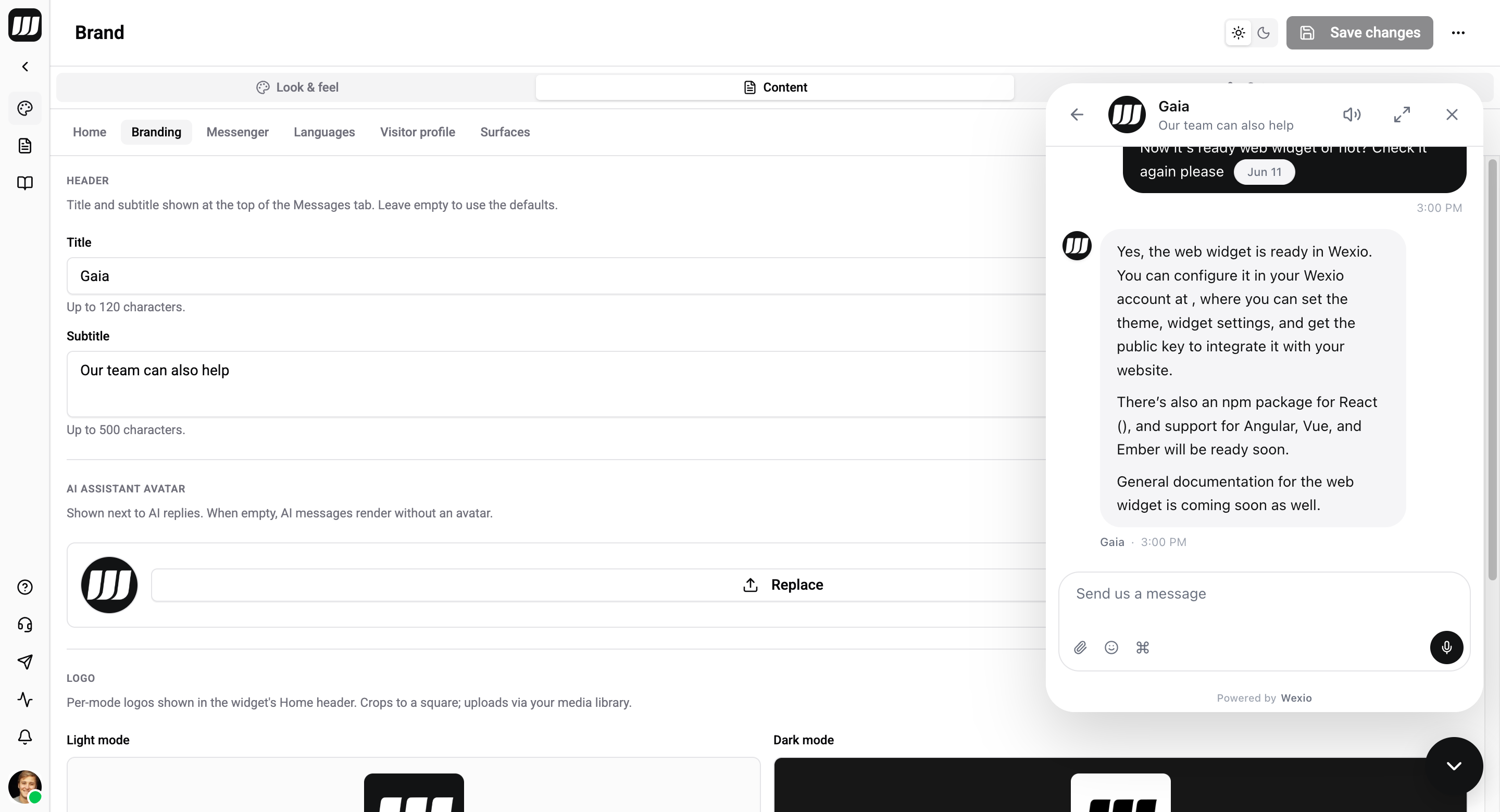
| Asset | Detail |
|---|---|
| Logo | Separate light and dark uploads. |
| AI assistant avatar | Shown next to AI replies. |
| Operator avatars | One or more avatars (each with alt text) for human agents — up to 3 in the header stack. |
| Header copy | The title and subtitle at the top of the Messages tab. Translatable. |
Messenger
The Messenger sub-tab has two sections: Slash commands and Welcome messages.
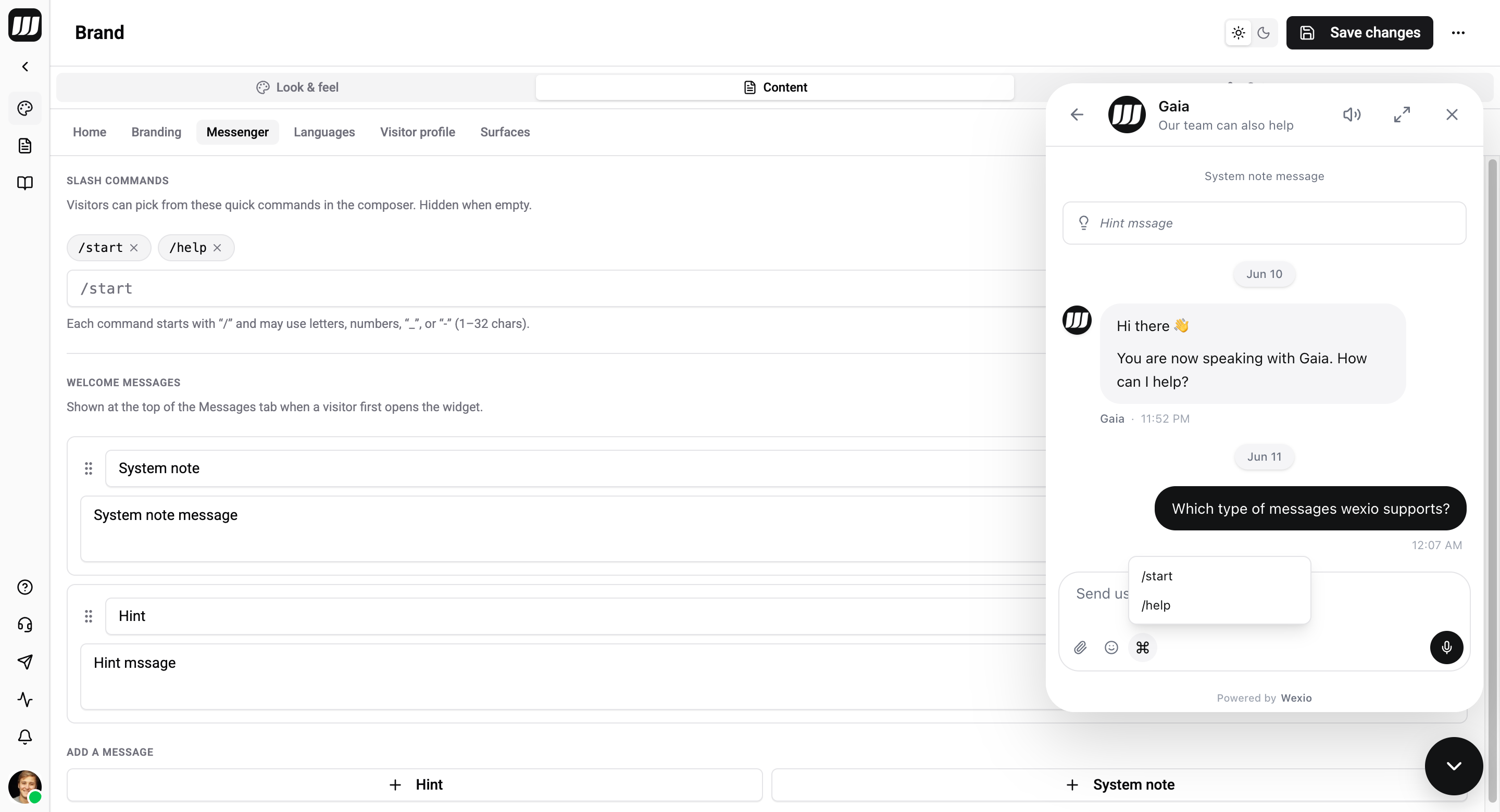
Slash commands
Quick commands a visitor can pick from the composer. The list is hidden when empty.
- Each command starts with
/and may use letters, numbers,_, or-(1–32 characters) — e.g./start,/help. - Add up to 20 commands. Type one and click Add; remove with the × on a chip.
Welcome messages
Preset messages shown at the top of the Messages tab when a visitor first opens the widget. Add up to 10, each of one of two kinds:
| Kind | Renders as |
|---|---|
| Hint | An italic pill. |
| System note | A centred system row. |
Click + Hint or + System note to add one, then edit its text. Messages are reorderable and translatable per locale.
The Messages-tab title and subtitle live under the Branding sub-tab, and the related-content / reaction-count toggles live under Surfaces → Content surfaces — not here. (In the widget config these are messenger.showRelatedNews, messenger.showRelatedHelpArticles, and messenger.showReactionCounts.)
Languages
| Setting | Detail |
|---|---|
| Default locale | Base language (default en). |
| Supported locales | Every language the widget offers; adding one unlocks per-locale editing for all translatable copy. |
| Content locale fallback | Whether untranslated content falls back to the default locale, or shows a "not translated" state. |
| Locale strategy | How the widget chooses the active locale per visitor. See Localization. |
Visitor profile
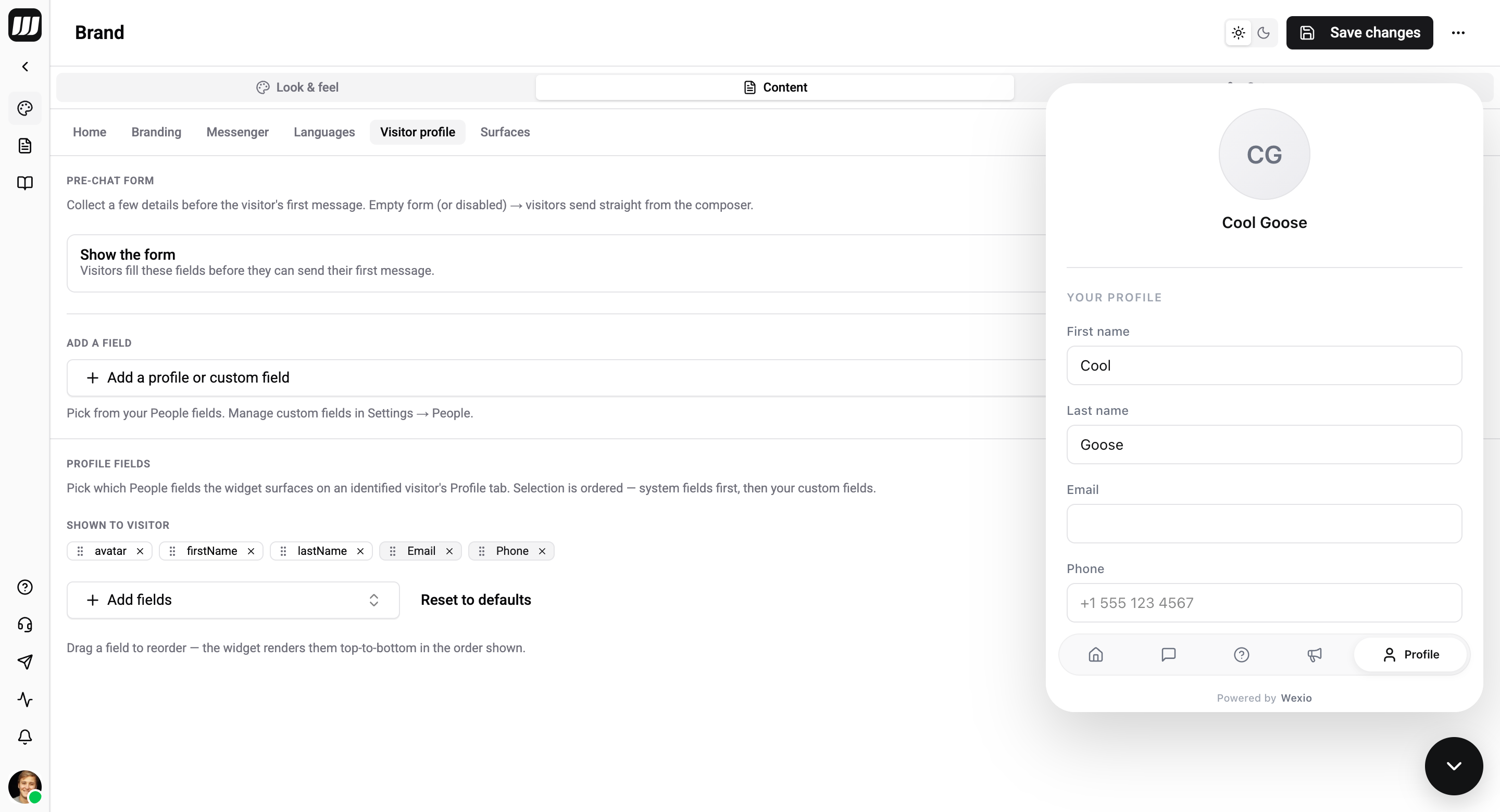
| Setting | Detail |
|---|---|
| Profile fields | Which visitor-profile fields appear in the Profile tab. Defaults to first/last name, email, phone. |
| Prechat form | A form shown before a conversation starts: an enabled toggle plus a list of fields (each has a kind — NAME / EMAIL / PHONE / CUSTOM_TEXT — a key, a label, and a required flag). Translatable. |
Submitting the prechat form fills the visitor's profile but is not verification — see Sessions & prefill.
Surfaces
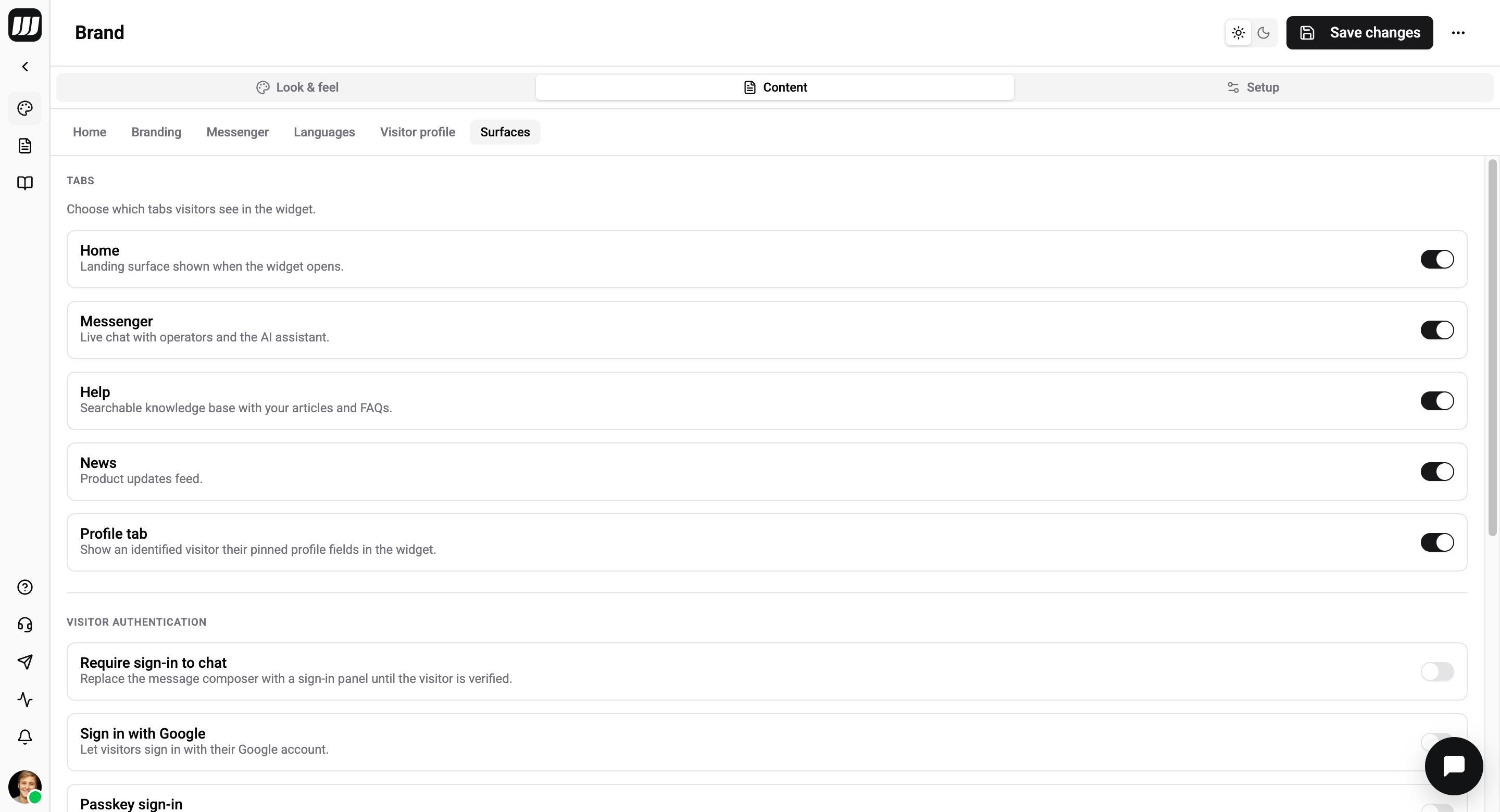
The Surfaces sub-tab is the control panel for what visitors see and how they get in. It has four sections.
Tabs
Choose which tabs visitors see in the widget. A disabled tab doesn't appear in the bottom nav; when only one is enabled, the nav disappears entirely (a single-surface install).
| Tab | What it is |
|---|---|
| Home | Landing surface shown when the widget opens. |
| Messenger | Live chat with operators and the AI assistant. |
| Help | Searchable knowledge base with your articles and FAQs. |
| News | Product updates feed. |
| Profile tab | Shows an identified visitor their pinned profile fields in the widget. |
Visitor authentication
This is where you turn the visitor sign-in methods on or off, right next to the tab toggles.
| Toggle | Effect |
|---|---|
| Require sign-in to chat | Replaces the message composer with a sign-in panel until the visitor is verified. |
| Sign in with Google | Lets visitors sign in with their Google account. |
| Passkey sign-in | Passwordless sign-in with Touch ID / Face ID / a security key. |
See Authentication for how each method works and what you configure server-side.
Content surfaces
Related-content blocks shown when a visitor is reading an article — these appear under the article being viewed, not in the chat conversation.
| Toggle | Effect |
|---|---|
| Show related news | Surface related news posts under an article the visitor is reading. |
| Show related help articles | Suggest related help articles under an article the visitor is reading. |
| Show reaction counts | Display tallied reaction counts on news and help posts. |
Branding
| Toggle | Effect |
|---|---|
| Hide "Powered by Wexio" badge | Removes the in-widget attribution badge. Available on Pro and Enterprise plans — on lower tiers the toggle is locked with an upgrade hint. |