Quick Actions
Add buttons or icon tiles to the Home tab that open chat, help, news or a link, and pick their icons
A Quick actions block shows one to four buttons. Each button opens the chat, the Help tab, the News tab or a link. Use it for the way you want visitors to reach you. You can add as many Quick actions blocks as the 20-block limit allows. To add the block, see Home.
Choose a Layout
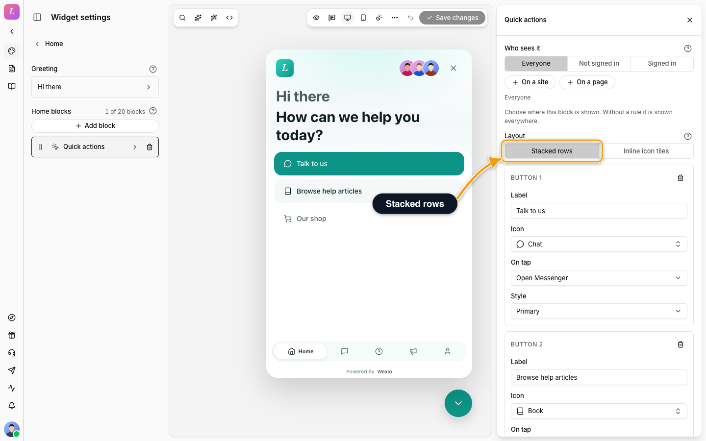
Layout sets how the buttons look.
- Stacked rows. One full-width button per row. This is the default. Long labels read well.
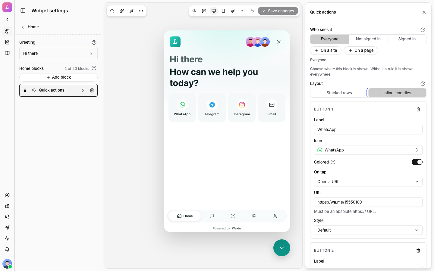
- Inline icon tiles. Square tiles in one row with the label under each icon. Best for channel switchers such as WhatsApp or Telegram.
Set Up a Button
A new block starts with one button: Label Send us a message, the Chat icon, On tap set to Open Messenger and Style set to Primary. Click Add button for the next ones, up to four. A new button is labelled New button. The last button cannot be removed.
| Setting | Notes |
|---|---|
| Label | Placeholder: Send us a message. |
| Icon | A searchable list. Pick No icon for none. See Icons. |
| Colored | Shown for brand icons only. Off by default. Off uses the widget's foreground colour, which is safer on dark or branded surfaces. On shows the brand's own colours. |
| On tap | Open Messenger, Open Help, Open News or Open a URL. |
| URL | Shown for Open a URL. Must be an absolute https:// address. Placeholder: https://example.com/pricing. |
| Style | Default, Primary or Ghost. |
Icons
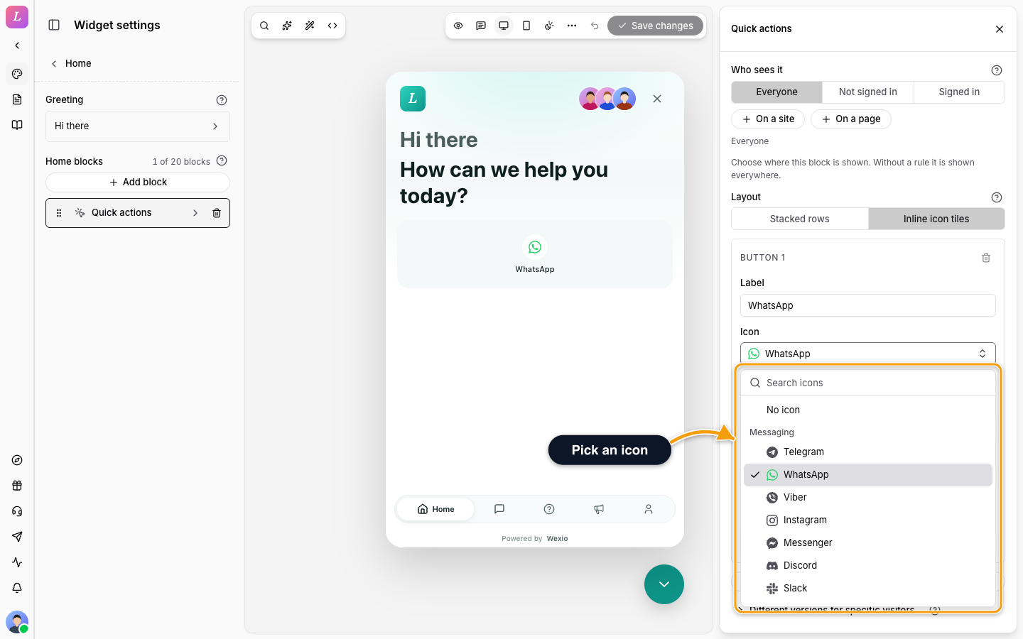
Type in Search icons to filter the list. The icons come in three groups.
| Group | Icons |
|---|---|
| Messaging | Telegram, WhatsApp, Viber, Instagram, Messenger, Discord, Slack, LINE, Signal, WeChat |
| Social | Facebook, Twitter, X, LinkedIn, Reddit, TikTok, YouTube, Threads, Pinterest, Snapchat, Twitch, GitHub, Spotify |
| Actions | Chat, Email, Phone, Video call, Help, Book, Bell, Star, Heart, Bookmark, Arrow right, Lock, Shield, User, Users, Globe, Calendar, Map pin, Shopping cart, Download, Gift, Document |
Messaging and Social icons are brand marks and can use Colored. Actions icons are always one colour.
Related
- Home - add, reorder and remove blocks.
- Block Kinds - the other blocks.
- Message Targeting - show a block to some visitors.
Home Block Kinds
What each Home block shows to the visitor and every setting of the Ask a question card, Recent message, Featured article, Help search, Pinned articles, News preview, Team status, Rich text and Divider
Messenger
Slash commands, welcome messages with variables and quick-reply buttons, and what visitors can send